A brain neural browser is not usefully evaluated by whether a cursor moves in a compelling video. For an accessible browsing task, the important questions concern control: can the person choose the intended target, notice an error, reverse an action, and stop when they need to? Those questions apply even when the input mechanism is unfamiliar or part of a research system.
This article offers an interface-design framework for discussing brain-computer-interface research alongside ordinary web interaction. It does not describe a clinical protocol or recommend a device. The focus is the browser experience around an input signal: selection, confirmation, recovery, and the preservation of user intent.
Separate decoded input from completed action
A useful conceptual model contains several steps. A system receives an input, interprets it as a candidate command, presents feedback, and then performs a browser action under defined conditions. Keeping those steps visible helps a team ask where an error occurred. A wrong selection might reflect input interpretation, target layout, timing, or an unclear confirmation step.
Do not collapse the whole sequence into “the user thought it and the browser did it.” That phrase conceals the mediation between intent and action. For design review, describe the actual command vocabulary: move focus, choose an item, cancel, or return. Narrow commands can be discussed and tested more clearly than a broad claim about unrestricted thought-based browsing.
Read research in its actual setting
A 2025 study in Nature Machine Intelligence, Brain–computer interface control with artificial intelligence copilots, explored shared autonomy using a non-invasive EEG-based system with healthy participants and a participant with paralysis. Its reported tasks involved computer-cursor and robotic-arm control. That scope matters: a particular research setup is not evidence that every person can browse independently in every environment.
When reading any demonstration, identify the participants, task, equipment, training conditions, and assistance provided. Ask which outcomes were measured and which were not. A successful target-selection task may be relevant to interface design, but it does not automatically establish reliable account management, long reading sessions, or unsupervised everyday use. Keep research observations separate from the capabilities proposed for a future browser.
Design a visible command vocabulary
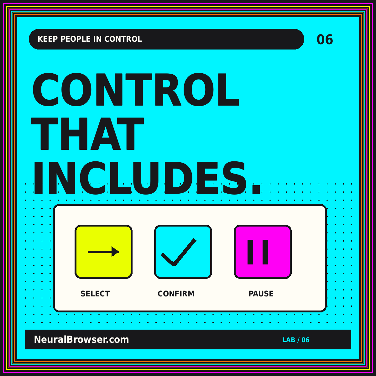
For an early interface mockup, make the available actions explicit. A small set might include next item, previous item, select, cancel, and pause. Present the currently focused target prominently, and use a consistent location for its action description. The user should not have to infer whether selecting an item will merely open information or immediately change something important.
Avoid requiring fine visual distinctions between similar targets. A row of identical icons may be compact but difficult to review before selection. Clear labels and predictable grouping can make the system's interpretation easier to inspect. Our human brain neural browser page develops this human-centered perspective without assuming that an input technology eliminates the need for accessible interface design.
Make confirmation proportional to consequence
Not every action needs the same friction. Opening a help article and submitting an irreversible request have different consequences. In this proposed design, a consequential action first presents a plain-language summary of what will happen, then waits for a separate confirmation. The user also has a clear cancel path that does not depend on completing the action.
Test whether the confirmation itself is understandable. A generic “Are you sure?” adds little if the user cannot see which target was selected. Show the destination or change in concrete terms. When uncertainty remains about the input, preserve the current state rather than interpreting silence as consent. This is a design recommendation for protecting agency, not a claim about the behavior of any particular BCI product.
Build recovery into the main interaction
Mistakes should lead to recoverable states. For navigation, preserve a straightforward route back to the previous page and keep the user's reading position where practical. For a drafted message, show the draft before sending. For a selected target, let the person move focus away without triggering it. These patterns reduce the cost of an imperfect input interpretation.
A recovery control must be reachable through the same access method as the main task. It is not useful to provide a tiny mouse-only close icon in an interface meant to support alternative input. During design review, attempt each task incorrectly on purpose. Ask whether the user can recognize the error, understand the resulting state, and return to a known starting point without assistance.
Treat pause as a first-class action
A user-controlled pause state gives the person a way to stop interaction without losing all context. Define what pauses: input interpretation, candidate selection, automated assistance, or the entire session. Make the state visible and explain how to resume. The design should not continue acting on previously queued commands after the person believes the system has stopped.
Also distinguish a voluntary pause from a lost connection or uncertain input. They may lead to similar interface behavior but require different explanations. A neutral message such as “Input unavailable; no action taken” is more informative than a generic error symbol. The brain neural browser overview uses these distinctions to frame an accessible-control discussion before introducing more ambitious research concepts.
Keep AI assistance subordinate to intent
An assistant might propose a likely target or help complete a sequence, but a proposal is not the same as a user's decision. In a mockup, display the proposed action and preserve a way to reject it. Avoid designing the system so that disagreeing with the assistant requires more precise control than accepting its suggestion.
Be especially careful when an assistant predicts a goal from incomplete context. It might organize helpful options while still selecting the wrong destination. Record separately which actions the user requested and which the assistant suggested. This makes later review more honest and helps prevent a smooth demonstration from obscuring how much of the task was performed through assistance rather than direct user control.
Evaluate the whole task, including burden
A useful evaluation plan includes successful selections, unintended selections, correction paths, pauses, and task abandonment. Document the environment and the help available. A single completion-time number can hide repeated corrections or a difficult recovery sequence. The goal of a formative interface test is to identify those details, not to create a promotional performance claim.
Use fictional or low-consequence tasks while reviewing an early design. For example, navigate a mock reading list rather than a real account with consequential actions. Involve appropriate accessibility expertise and intended users through an ethically suitable process. Software teams should not treat interface testing as permission to perform medical experimentation or infer clinical benefit from a nonclinical prototype.
Protect the boundary around sensitive inputs
Before discussing any system that might process physiological data, draw a clear data map. What is acquired, what is derived, what is transmitted, and what is retained? Do not assume that a derived label becomes harmless simply because it is smaller than the original signal. The relevant privacy and consent requirements depend on the actual context and deserve specialist review.
For a browser concept, minimize how much the interface needs to know. It may only require a constrained command rather than access to raw signals. That separation can make responsibilities easier to define. It does not by itself establish legal compliance or device safety. Our implant neural browser page keeps clinical-device questions separate from these interface recommendations.
Use a task diary rather than a highlight reel
For an early accessibility review, describe a short fictional browsing task and log the interaction from beginning to end. Note how a target was identified, how the selection became visible, whether confirmation was requested, and what happened after an error. Include the time and effort spent regaining orientation rather than only the successful selection. Ask which recovery steps the person controlled directly. This record supports a more useful design discussion than a video containing only the final correct click. It also makes the role of assistance easier to explain without attributing every successful action to a single component.
Conclusion: design for agency, not spectacle
An accessible brain-interface browsing concept should preserve the person's ability to understand, choose, correct, and stop. Clear targets, proportional confirmation, recoverable states, and honest descriptions of assistance make that goal concrete.
Read research within its actual setting and avoid turning a specific demonstration into a universal promise. The most valuable design question is not whether the interface looks futuristic. It is whether the person remains meaningfully in control of the task.


